Same (So all may eat) Cafe
For this project I was tasked with rebranding Same Cafe, a local nonprofit community cafe located at 2023 East Colfax Avenue, Denver Co, United States.
Process
-
The starting point for this project was to research the cafe founders, partners, competitors, demographic, and social commitment.
“Our mission is possible through generous donations from individuals, foundations, and corporations.”
-
After thoroughly researching Same Cafe I was able to narrow down core values and key attributes that would contribute to the conceptualization of the logo.
Equality
Fresh and locally grown produce
Community
Dignity
Health
-
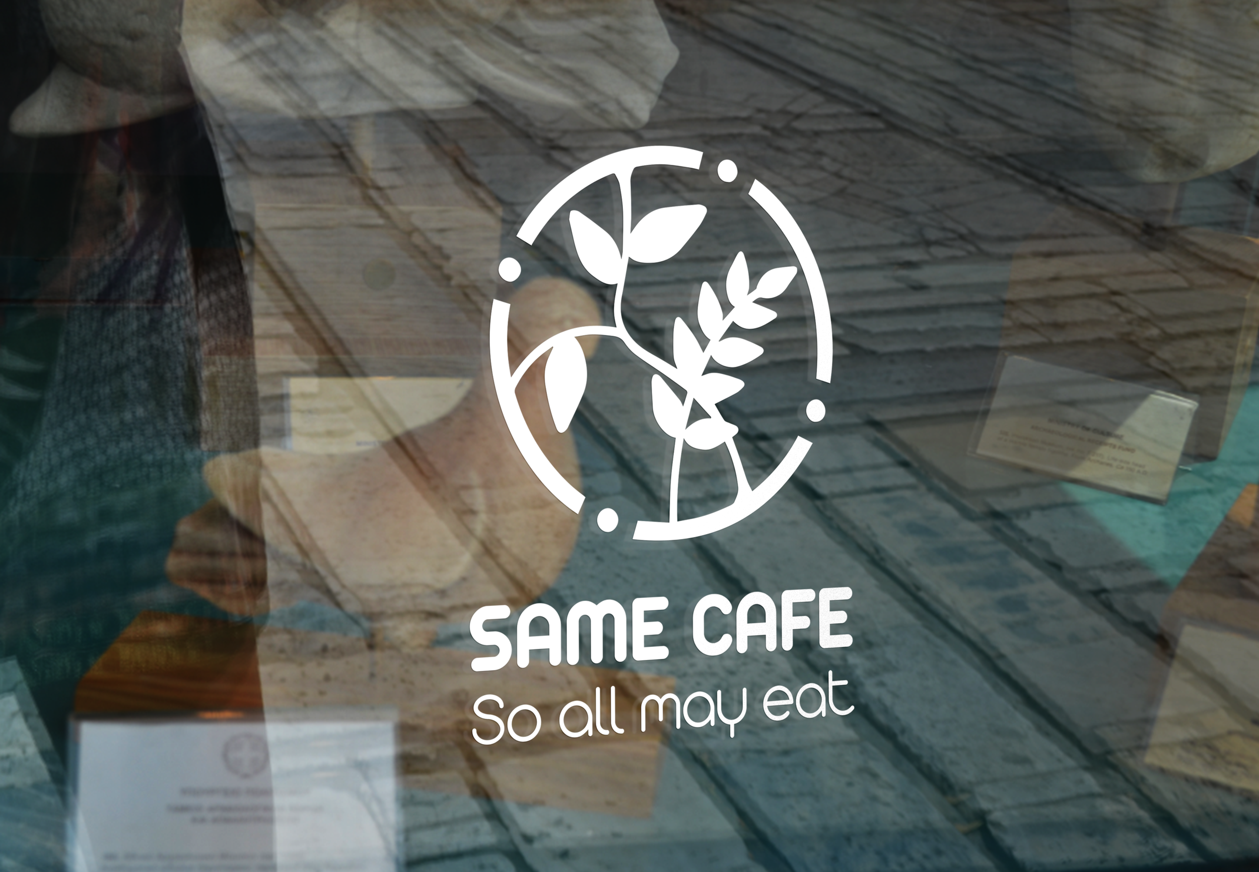
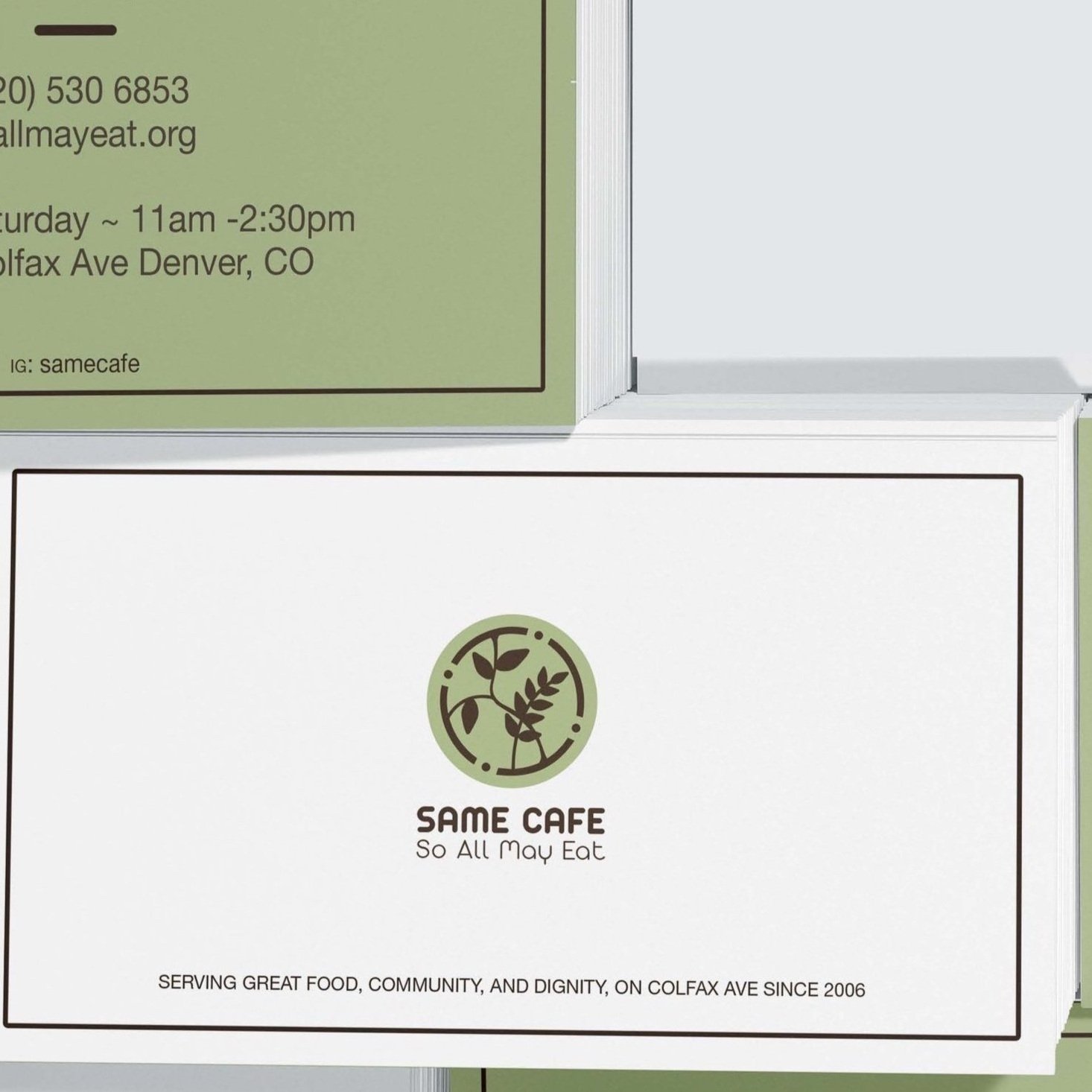
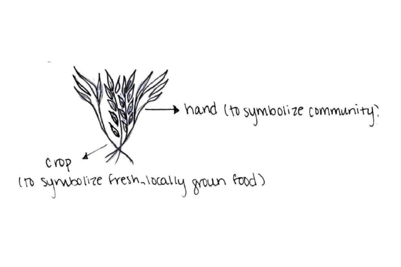
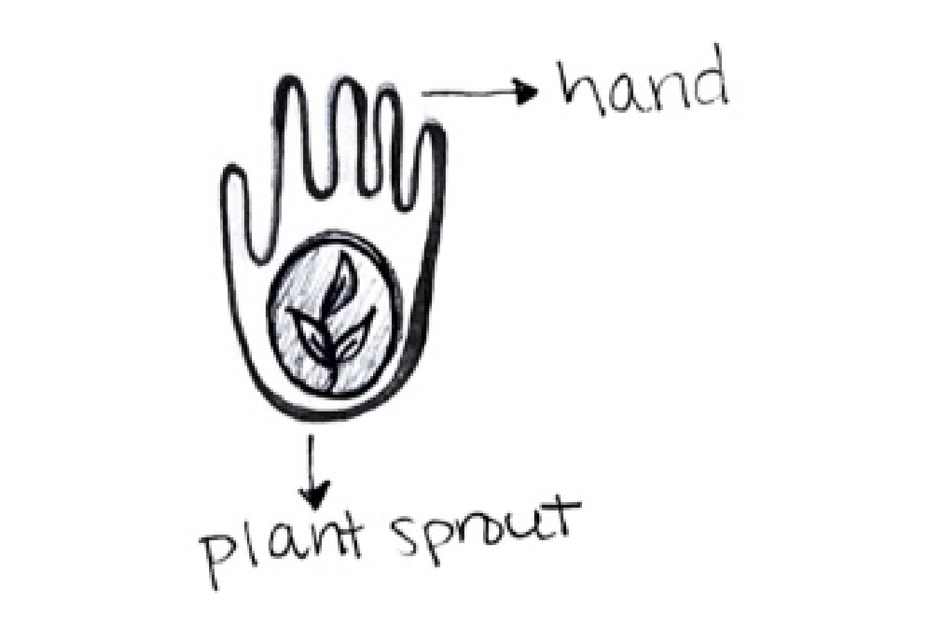
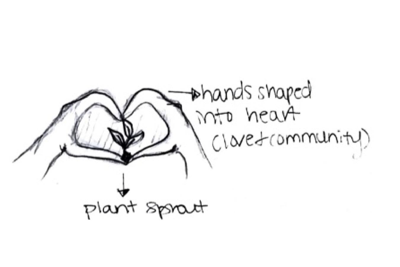
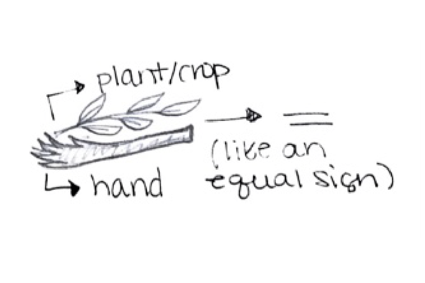
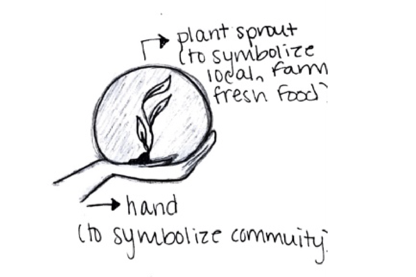
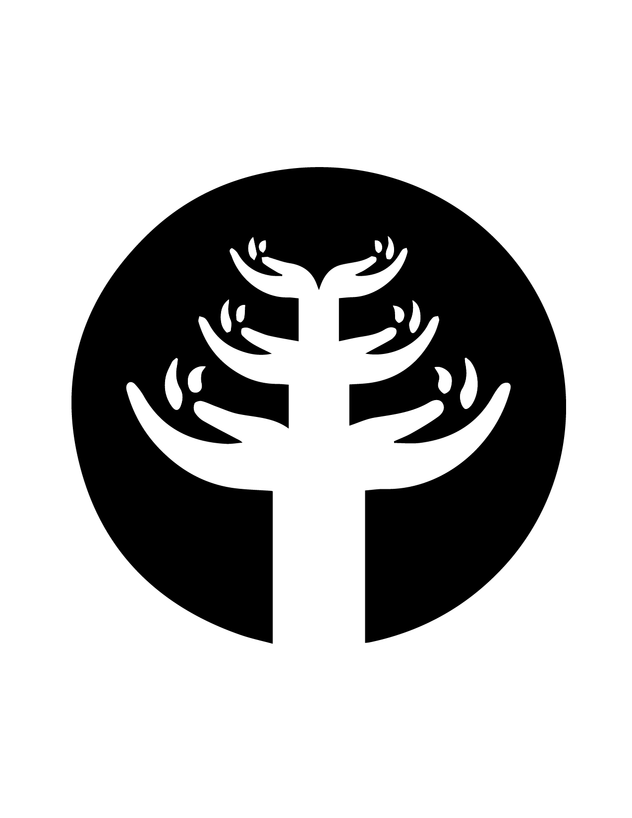
The concept for the final logo is centered around fresh and locally grown produce while also creating a sense of community through the circle that encloses the iconography. It subtly signifies an overhead view of people holding hands, surrounding the produce.
-
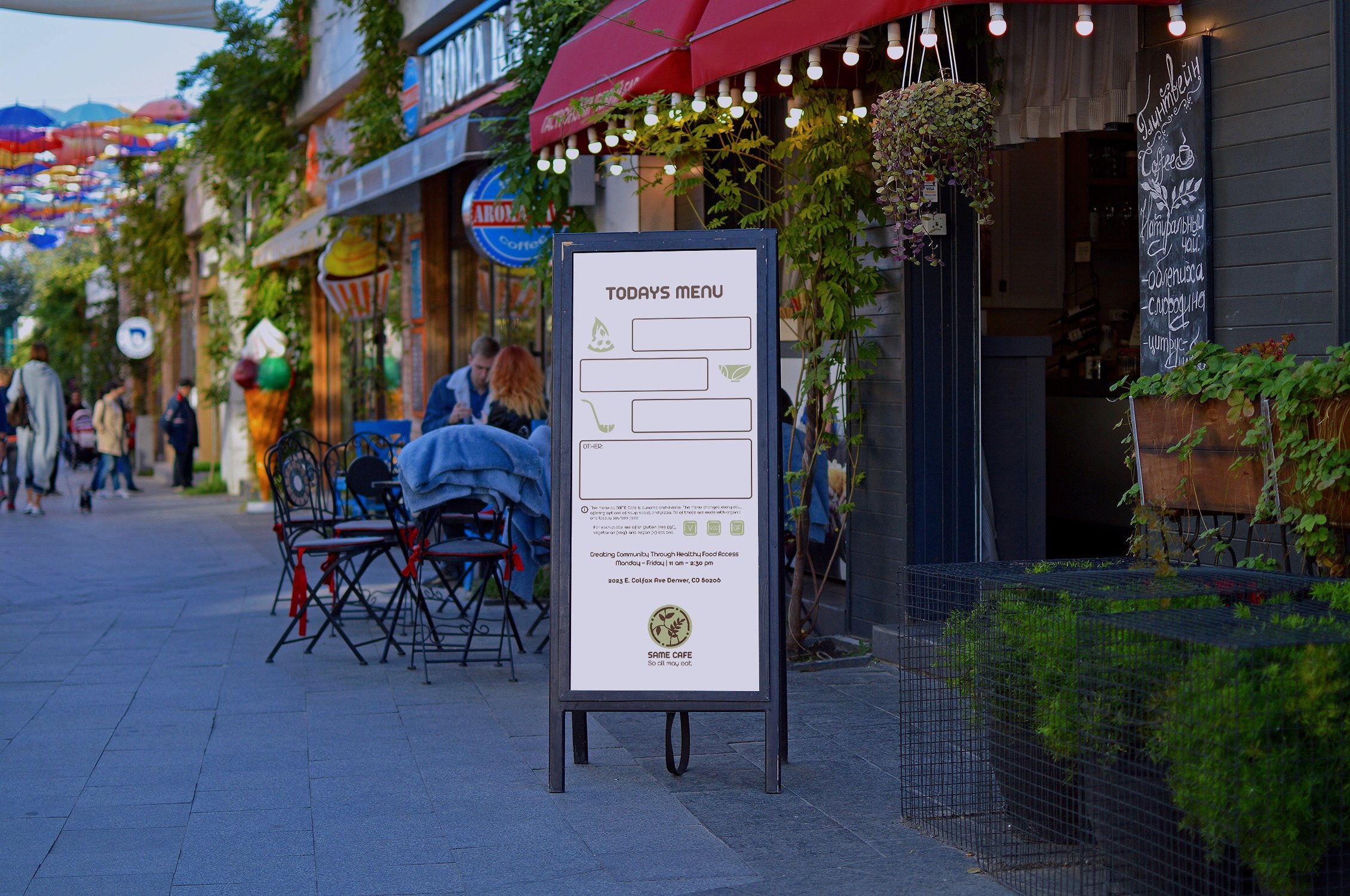
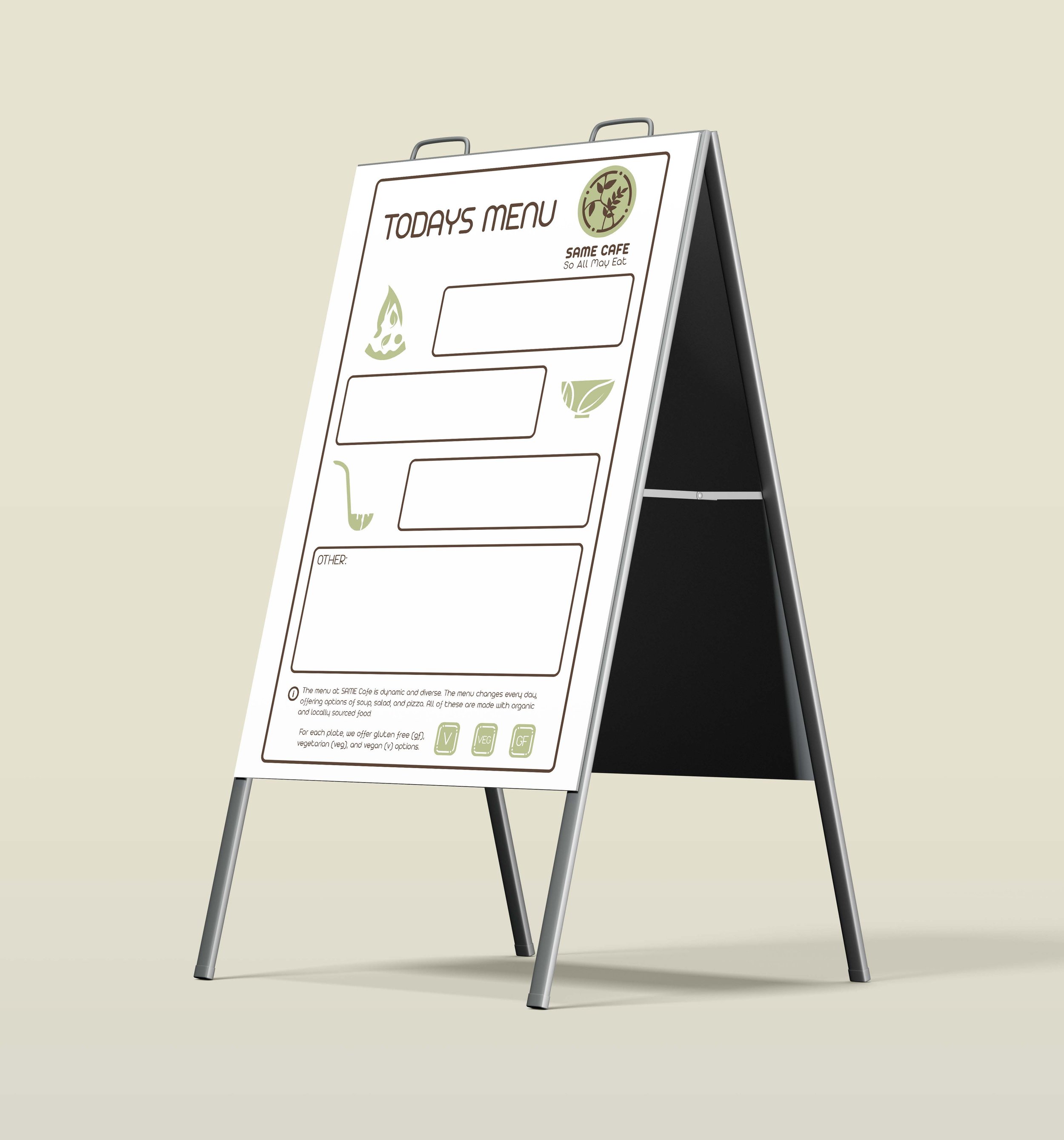
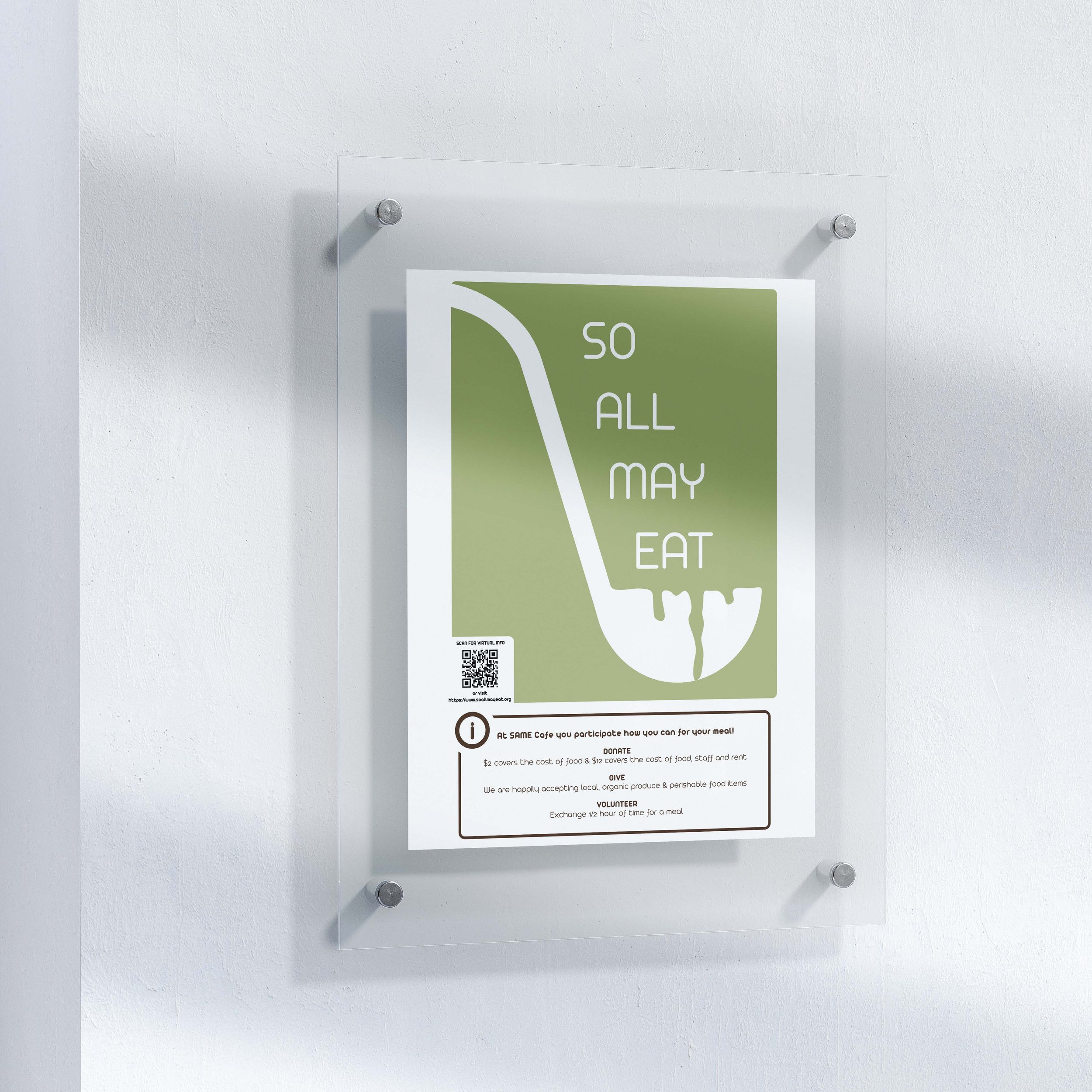
What’s interesting about Same Cafe is that their menu changes everyday. In order to make the customer experience easier, I designed a flexible whiteboard menu that organizes commonly served food items into categories that Same Cafe consistently serves. I also designed a poster that explains how the community can get involved, either through financial donations, food donations, or volunteering to work service hours at the cafe.
Original Branding
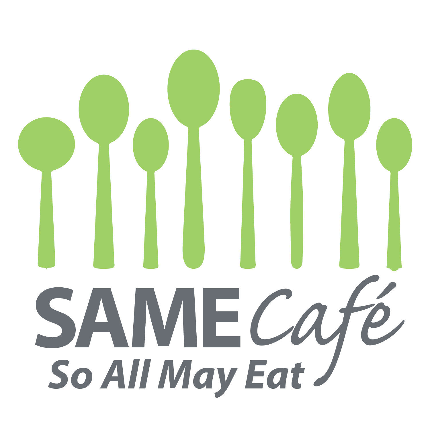
The use of green for the original branding was a strong choice as it creates a sense of friendliness and suggests a fresh, natural, and organic sensibility. I kept this design choice in mind while developing the style and tone of the new brand identity. One of the design challenges with the original brand typography was that it appears disconnected from the spoon graphic, and does not tell the brand story or communicate the brand promise as well as it could.

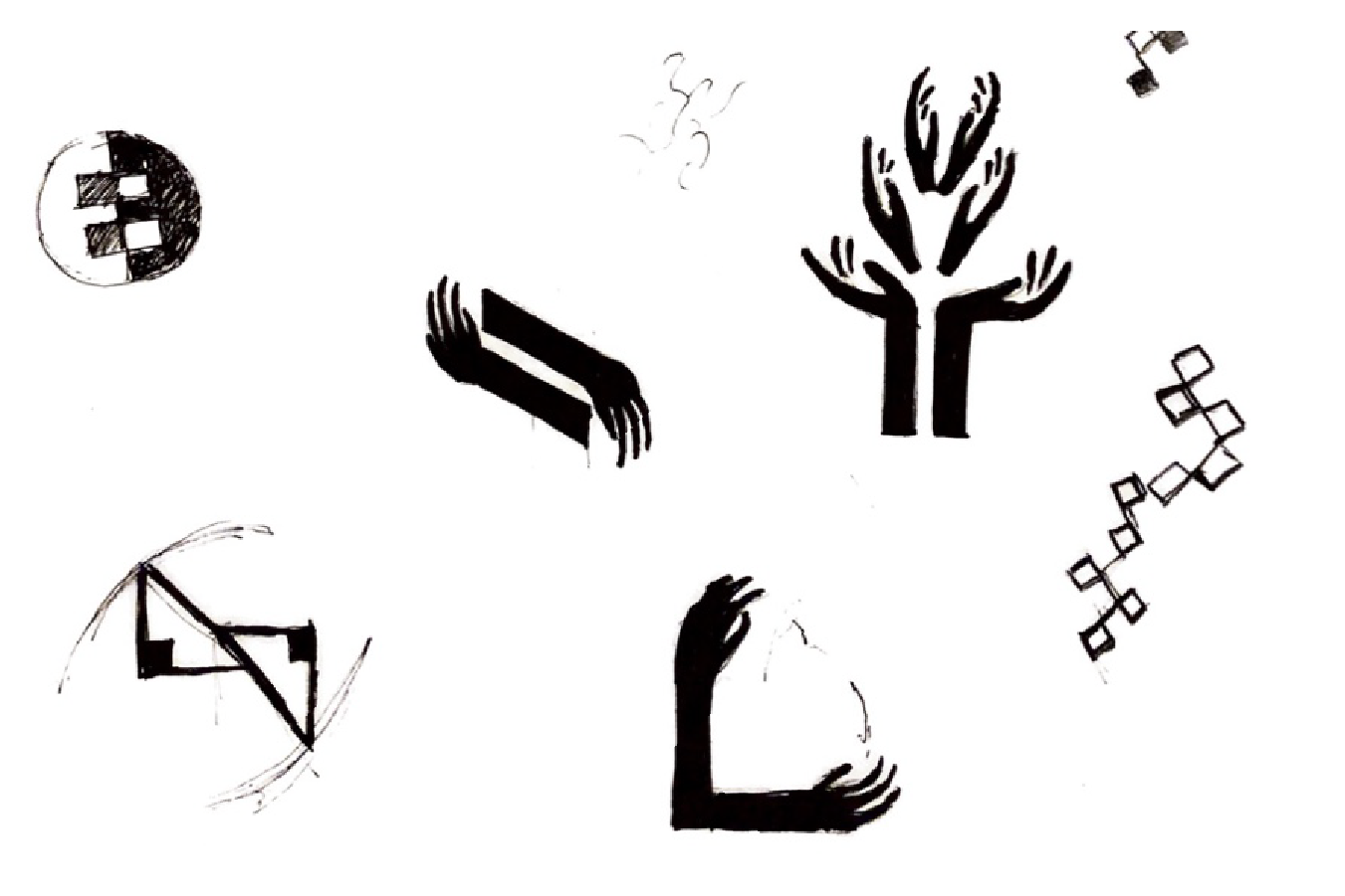
Logo Concepts
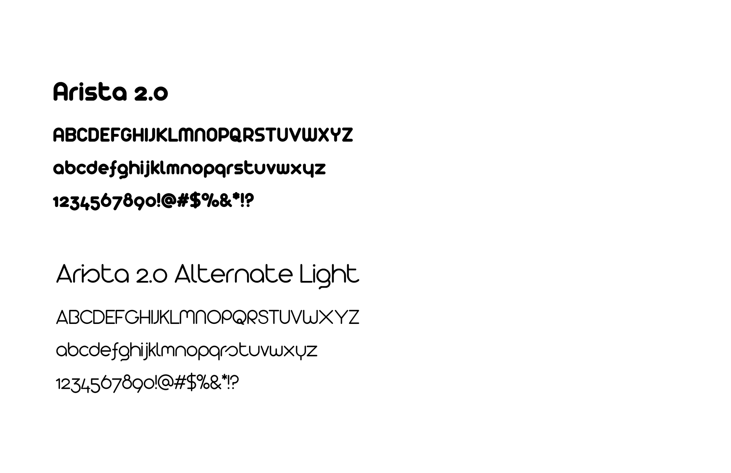
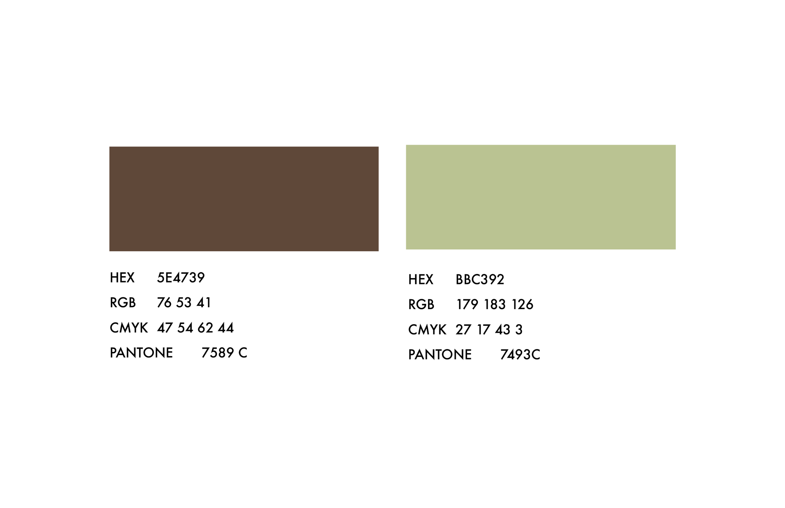
Typography & Color
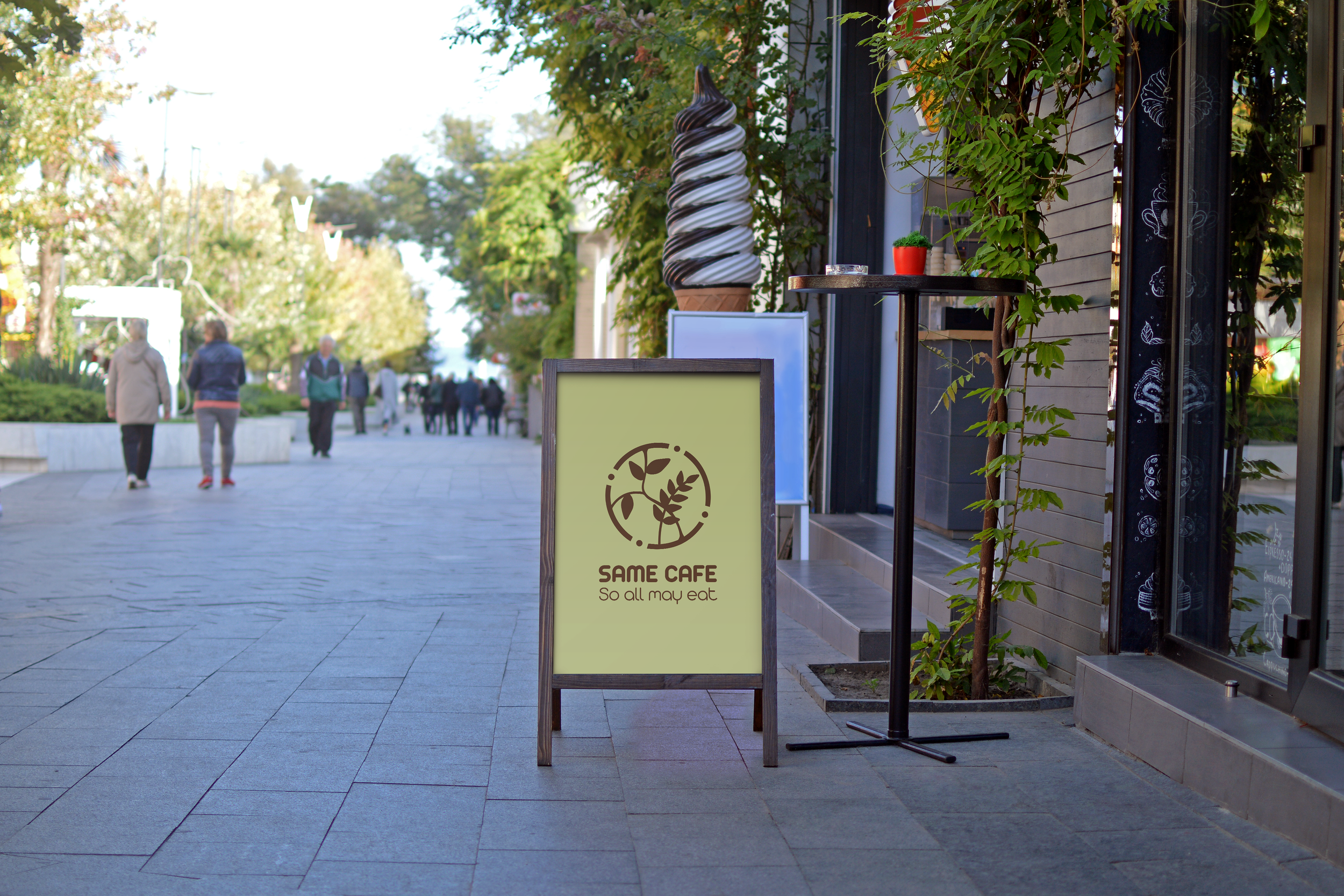
Proposed Rebrand

